REGIS
Role: UX/UI Design
Problem: Address usability issues, improve flow and modernize UI, bring visibility of existing and upcoming tools
Solution: Create channels to store user feedback, test improvements with users, get collect input from sales and support team.
What is REGIS?
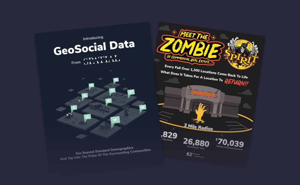
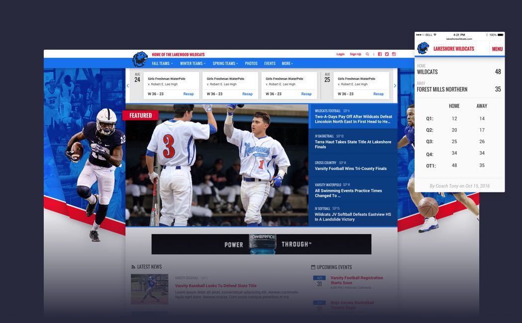
REGIS is a commercial real estate location analysis tool that gives brokers, agents, and developers the data they need to determine if a location meets their business or client’s needs. The data is a customized range of demographic, traffic, and competitor data that is then exported into a map or report based format allowing users to determine if a location can be developed, rented, or expanded into.
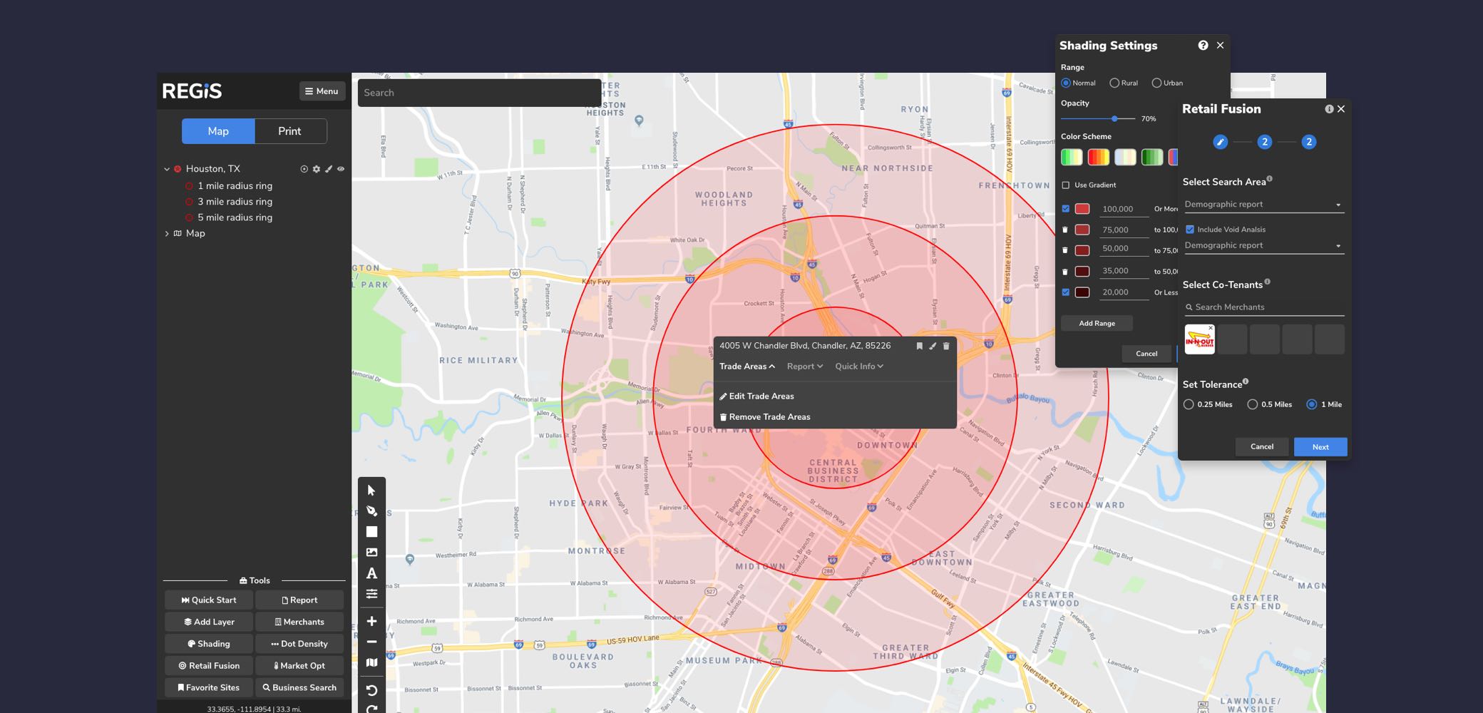
Old version of site with trade area.
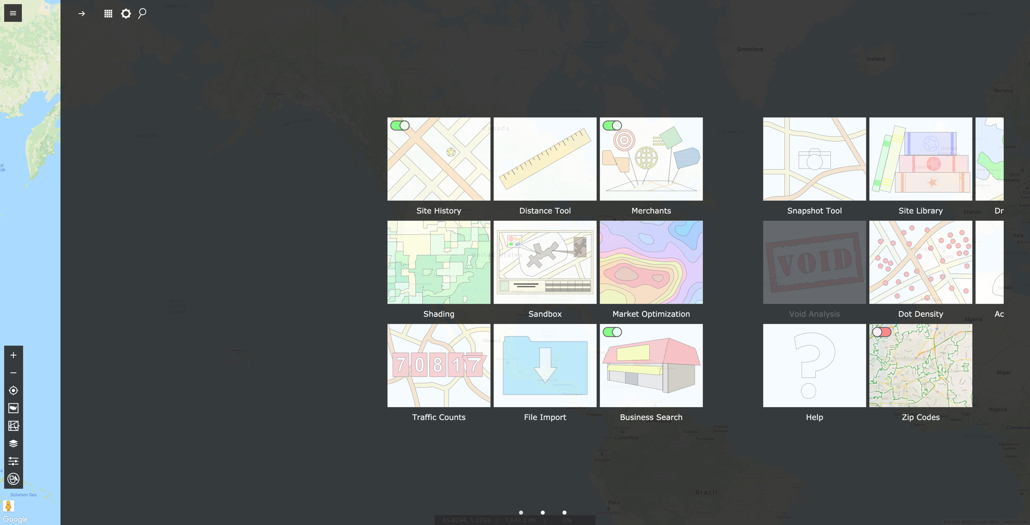
Old version of dashboard.
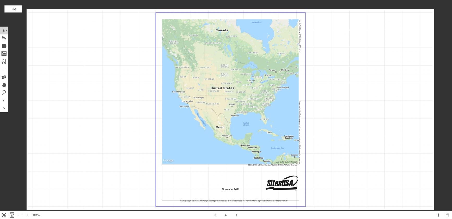
Old version of print mode.
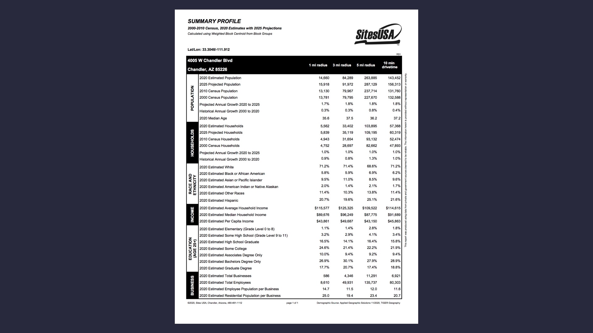
Old version of demographic report.
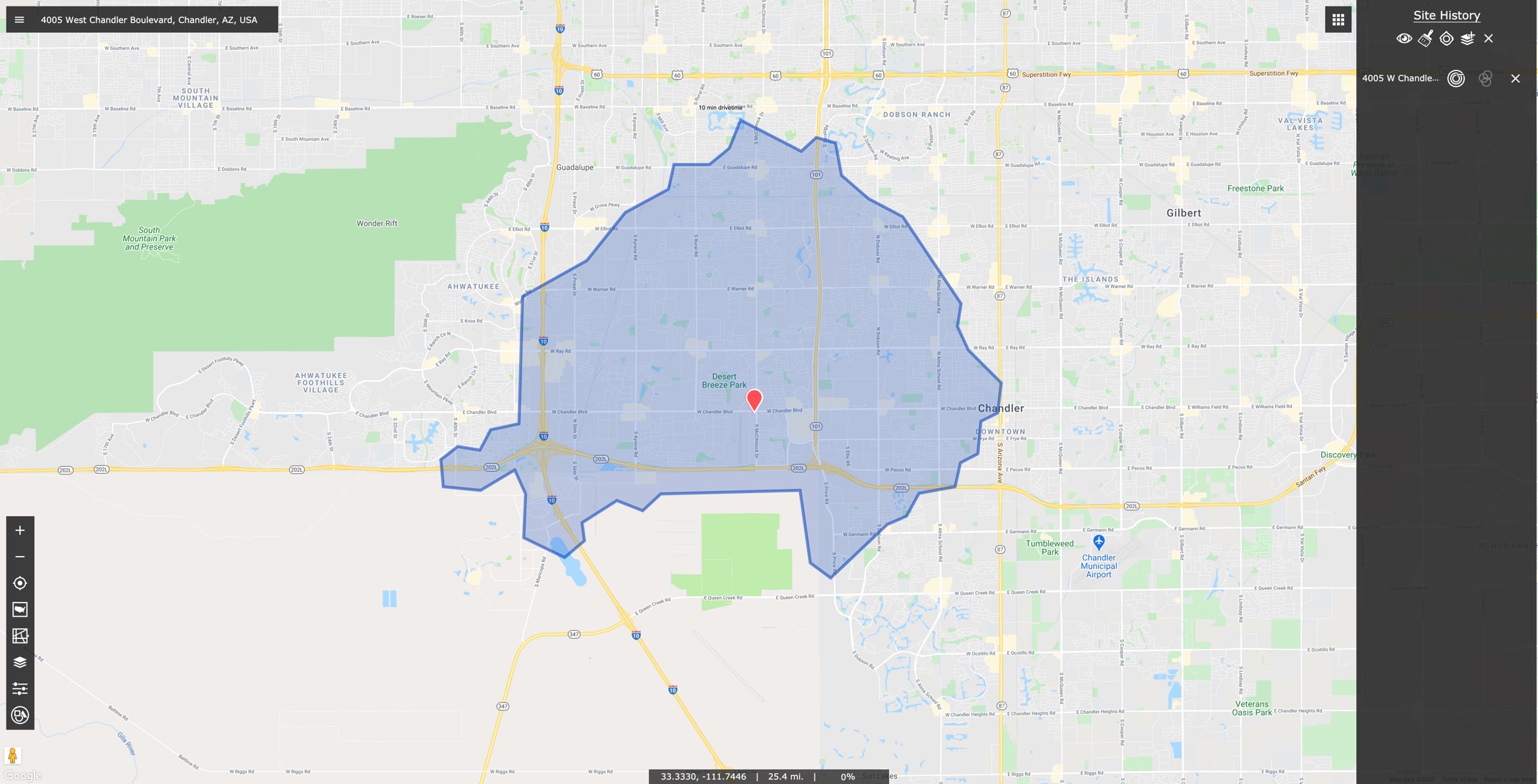
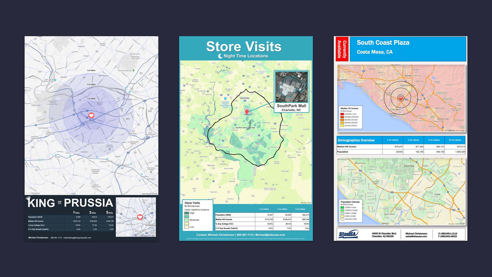
Sample of user created map.
My Role
My role for this project was to design a new interface in order improve existing tools based on user feedback, as well as making room for new features that are being added into the program.
-Address issues with program (zoom tool etc,)
-Test design and new features/ui (usability testing)
-Determine user needs/pain points (email campaigns user interviews)
-Validate requested features (research for api/data embed)
-Create channels to collect feedback (channeling support/QA)
|
Research |
Initial Research
To deliver a more purposeful design to our users, I needed to know and understand our audience as best as I could. I started by collecting the existing assumptions Sites USA had about their users, these existing assumptions revolved around each of the users roles within the commercial real estate industry. Regis users typically worked for a landlord, a developer, or a broker each of which had unique motivations that made them successful in their role.
Initially all the research that the company was doing revolved around tracking what features their users used most frequently. I emphasized that this information was a great start to understanding their users within the program and in their industry, but we also needed to take a deeper look at who our users are as people. After some convincing I reached the point were I was given a small list of users that I could test/interview with to show the company what a basic user test would look like, and what they could get from it.
User Research
With these initial tests and interviews I took note of who was actually using our program, and found out it was rarely the person who signed up for the account, (which was the cause of some communication issues with the users) but they were often the primary account holder’s assistant, marketing department, or secretary for that primary account holder. This answered some of the questions we had about how to prioritize what needed to be worked on, and guided some of the usability testing I would do for the new version of the software.
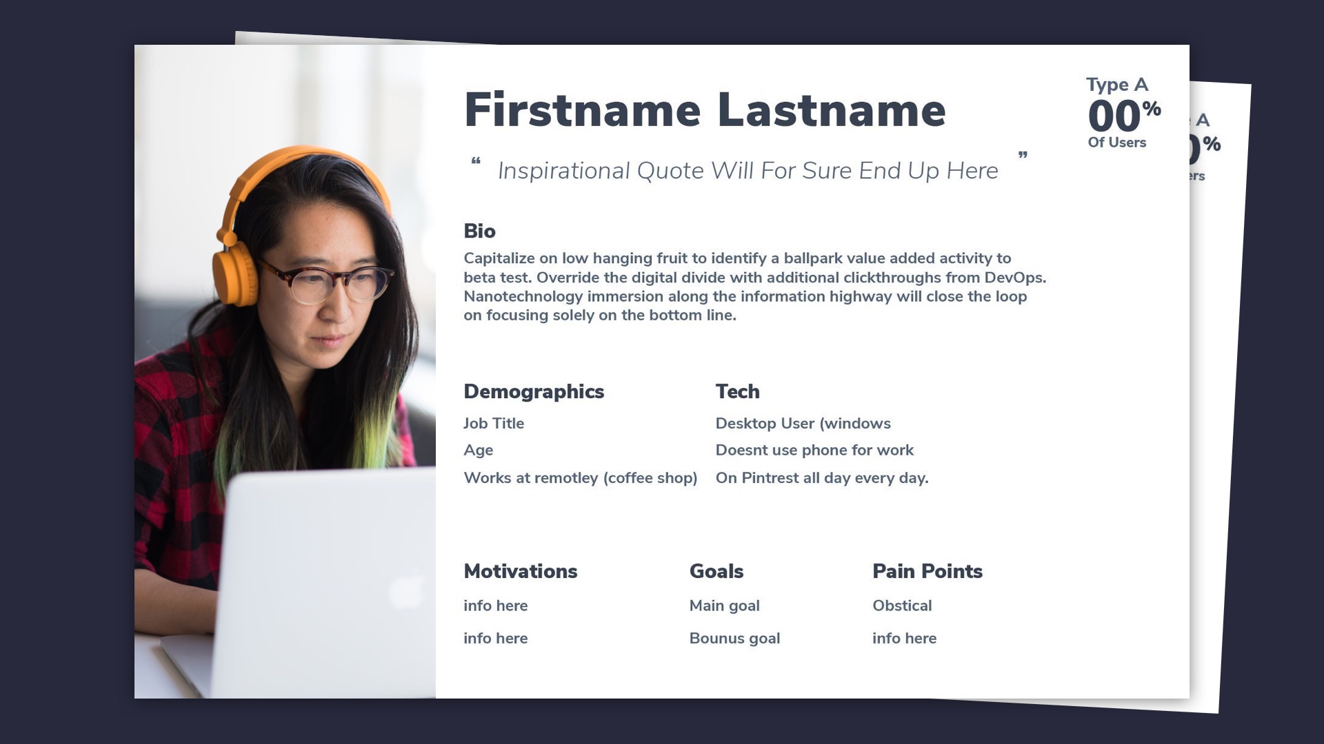
Regis user persona.
I discovered that many of our planned features misaligned with some of the issues these people were having with the existing version of REGIS. Our users were mostly dissatisfied with the general flow of the program, and having to use work-arounds for a desired output. One specific example of a work-arounds was that there was no way for users to fit their maps in the print mode of the product. The result was that they often had to take a screenshot of the webpage, or forgo the layout portion of the product. This was one of the most requested ‘features’ and it wasn’t anything new to the program, but something that could be worked into an existing feature.
Company Goals
While working on REGIS I also tracked the internal needs of Sites USA. One of these needs was that some of the sales team had a difficult time demonstrating a few of the add-on features to our clients. This was due to a lack of visibility within the basic membership version of the product, so we agreed that REGIS needed to be able to showcase new features within the product. This would not only help sales, it also highlighted some of the features users didn’t know existed in REGIS.
The support team was also incredibly helpful in aiding the design process of the product, because they were often the first to hear from users calling in with questions and complaints. To capture some of this feedback collected by support my team created a channel for them to log this information. We took the feedback from this channel and entered it into our database to get a rough idea of what wasn’t working as well as it should be.
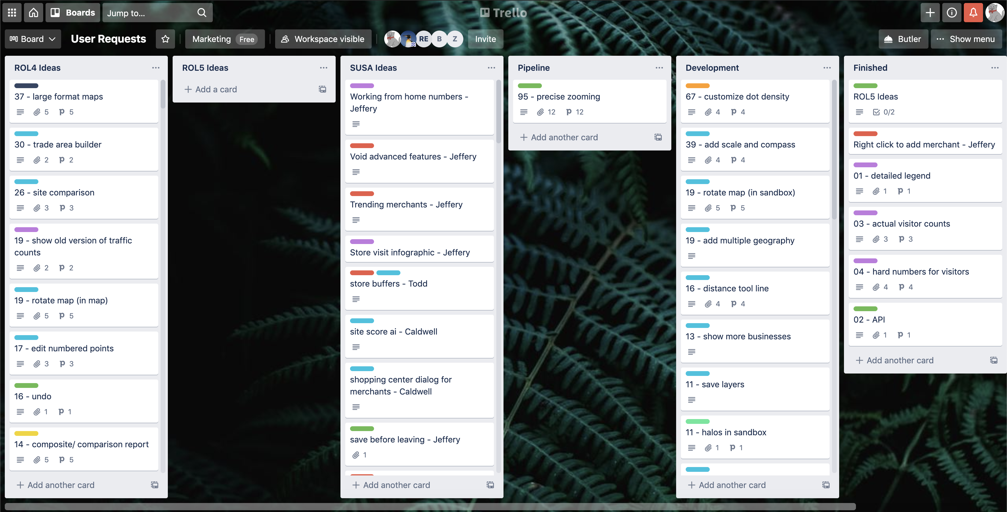
User requests
Technical Requirements
The technical requirements were simply to update the application’s front-end into something that was much easier to maintain. The key to meeting this requirement was designing a UI that was flexible, and included a consistent design guide that could be used as the program continued to add features.
|
Design |
Iterations
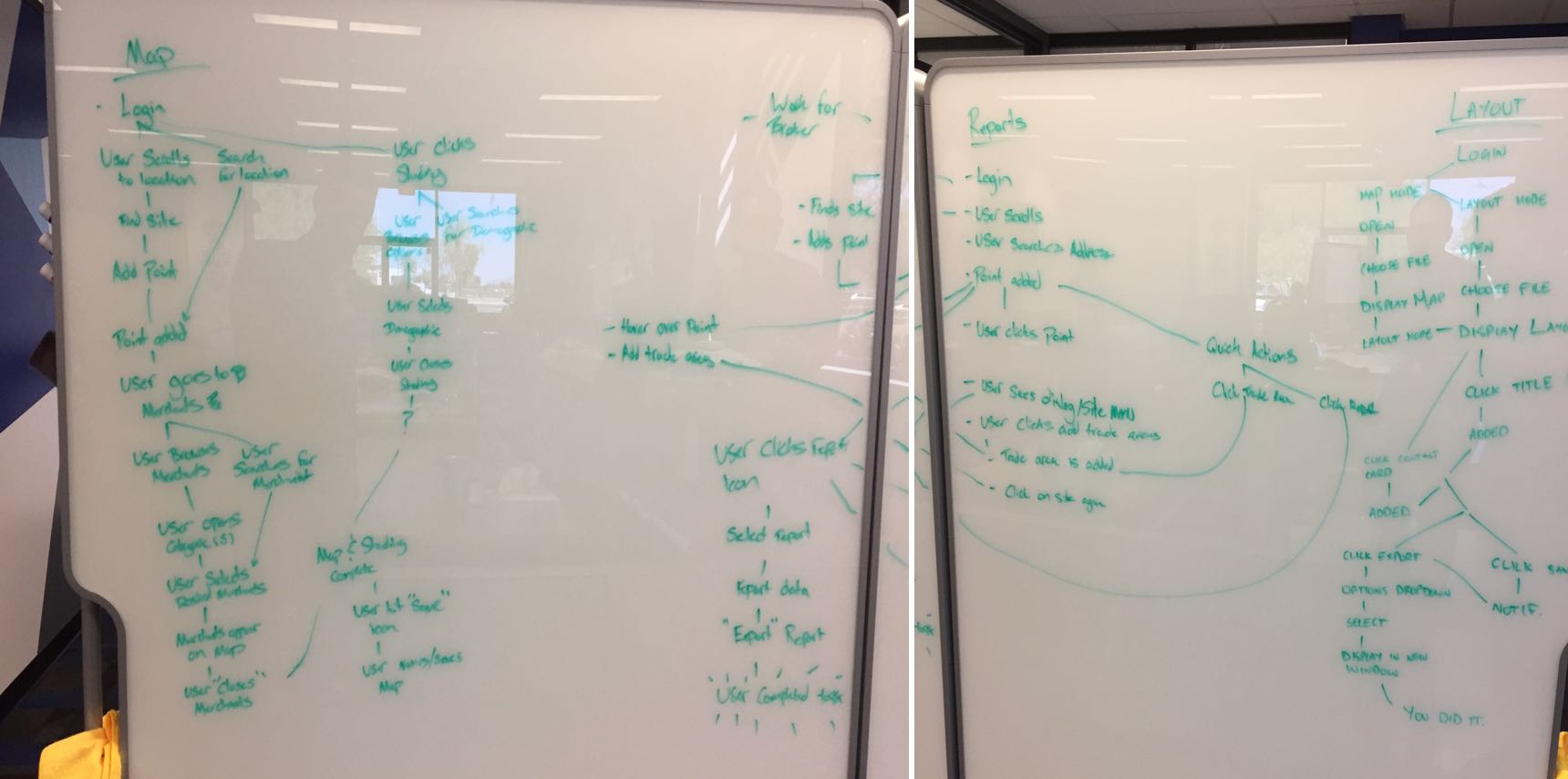
Design tasks in REGIS were broken into small iterative stretches. We started with the core functions of the program as determined by our in-house tool usage site. These functions were what the most users initially signed up to use, and were vital to get correct. We then sketched existing user flows for these tasks, and looked to see what improvements if any there was to be made.
User flow for prototype.
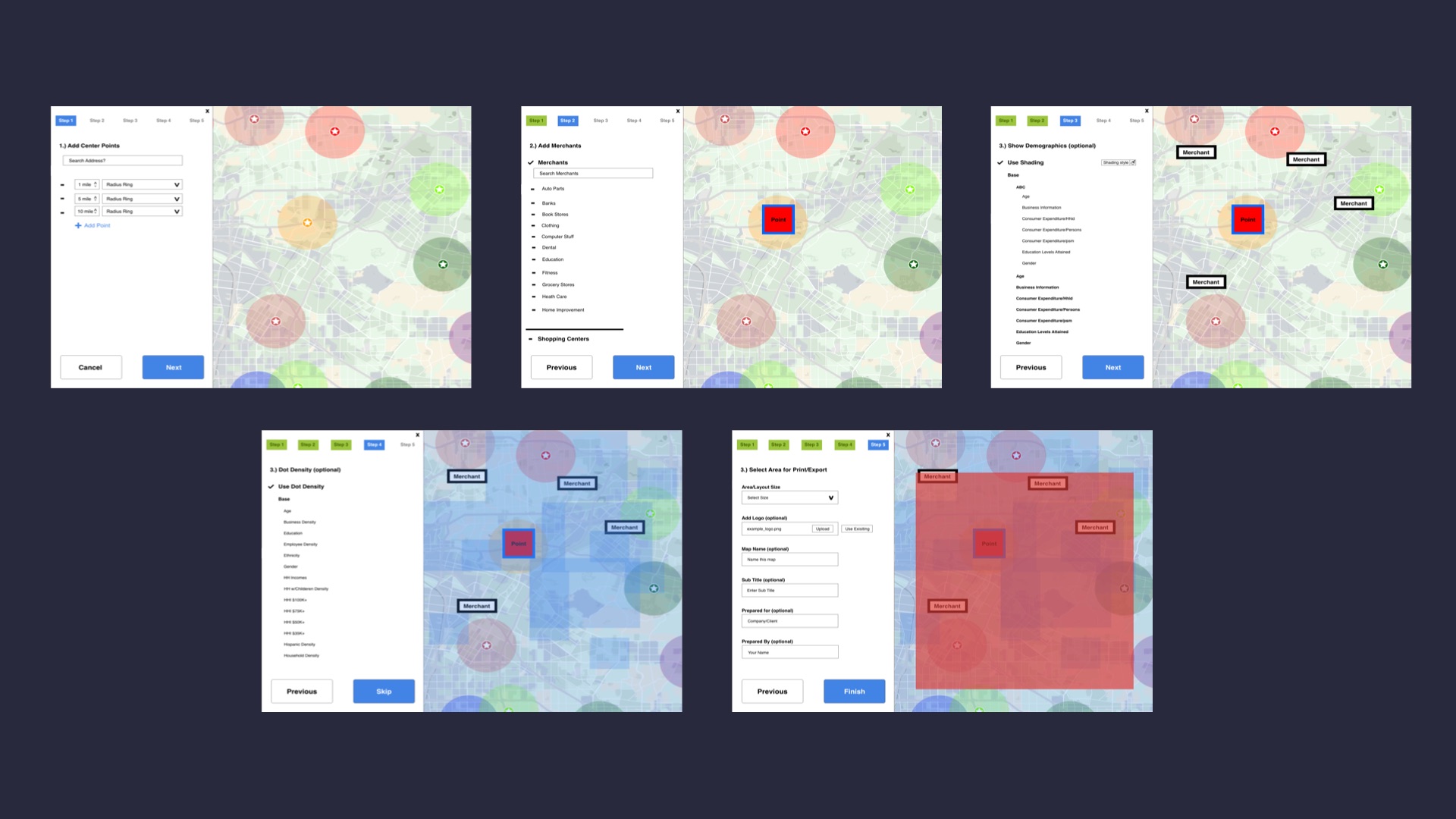
The initial design consisted of adding retail merchants to the map, creating demographic heat maps, and running reports on a location.
Low fidelity designs.
User Testing
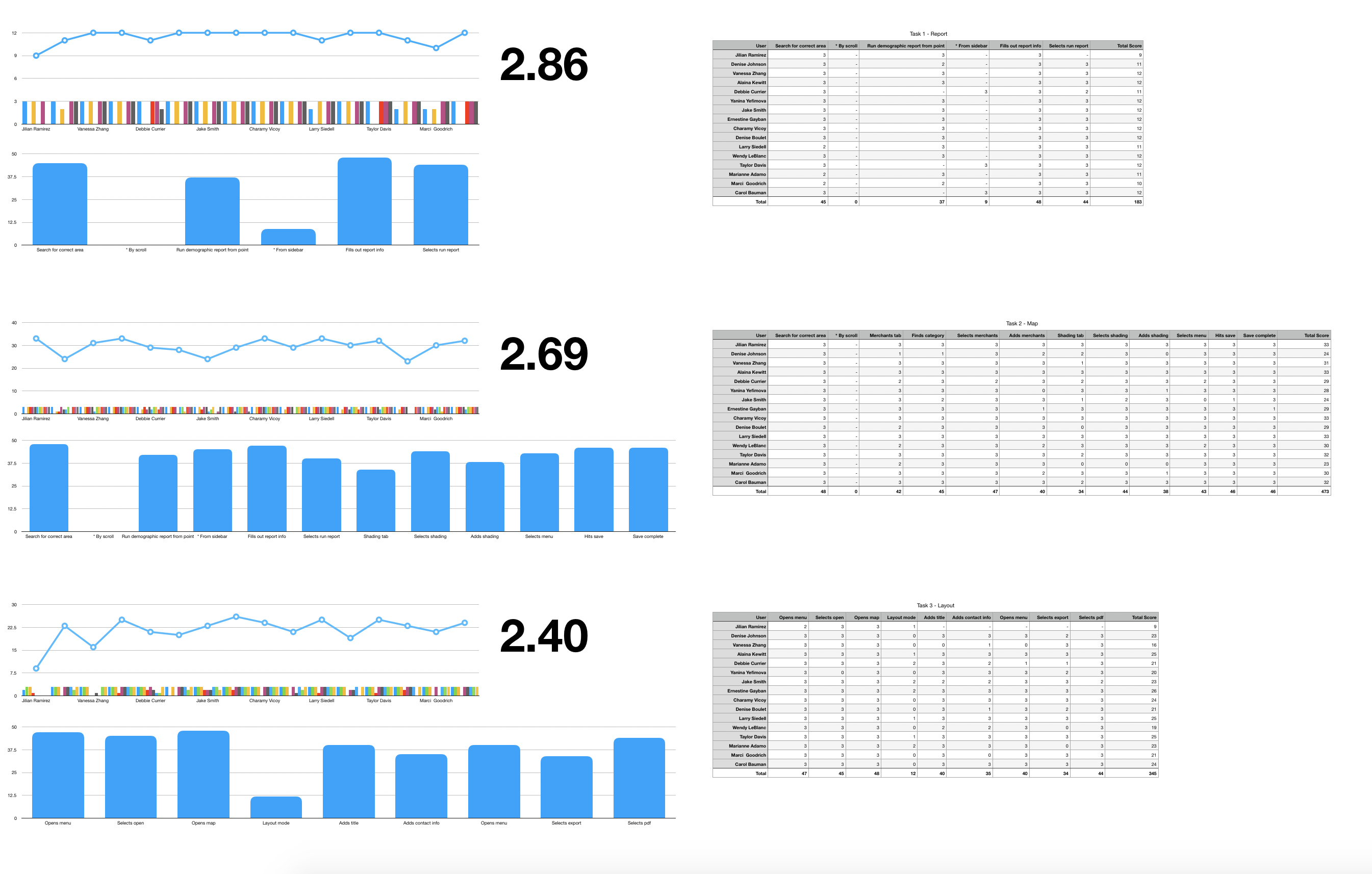
We tested usability on both the old version and the new version. Testing was done by scoring some of our users as well as employees and random people. Part of the reason I choose to include employees was because I was selling the UX process to the company, and was the first person working here that had UX experience. By showing Sites USA some basic UX process allowed them to trust me enough to do more research/UX/UI in the future. From there, I gave some of the users a handful of tasks, and watched them as they worked their way through a prototype design. I would then score them on a scale of 0-3 for each task (see below example). This provided me with some ‘hard’ data that Sites USA could use to determine what areas needed to improve. Some of the things I found was low visibility of some of the features, and a lot of obscure icons that didn’t best convey the tool they where made to interpret.
User testing results.
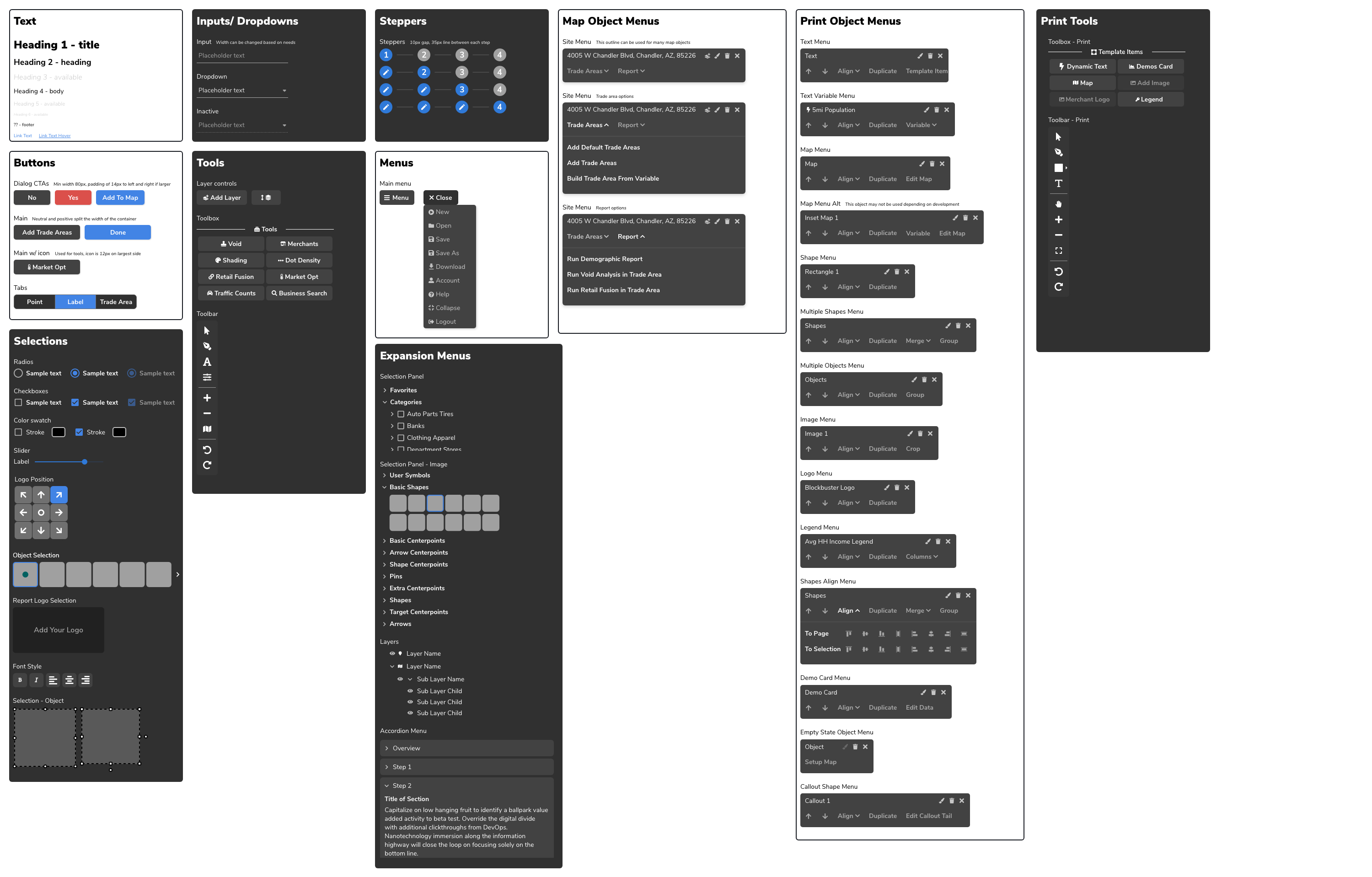
Design guide.
|
Release |
Final Designs
As it stands now the new version of REGIS is currently in beta. Most of the current efforts are being put toward ensuring the product launch is as smooth as possible. This includes bug fixes, minor design changes, and communication of what will change for existing users. Below are some samples of the new product (features may change slightly or be out of date).
New version of map mode.
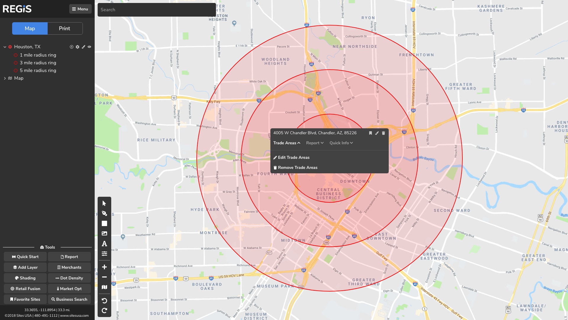
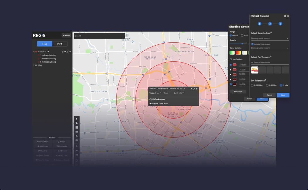
New version of site menu with trade area.
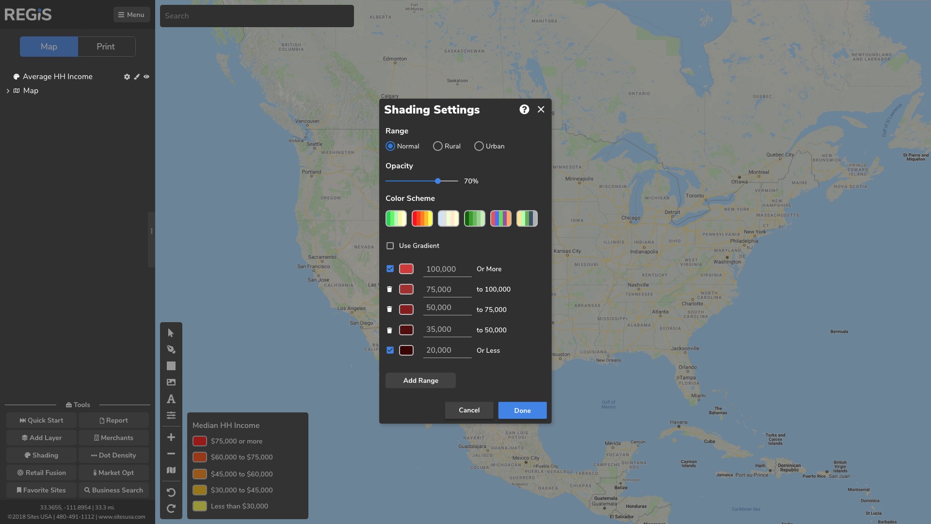
New version of heatmap settings.
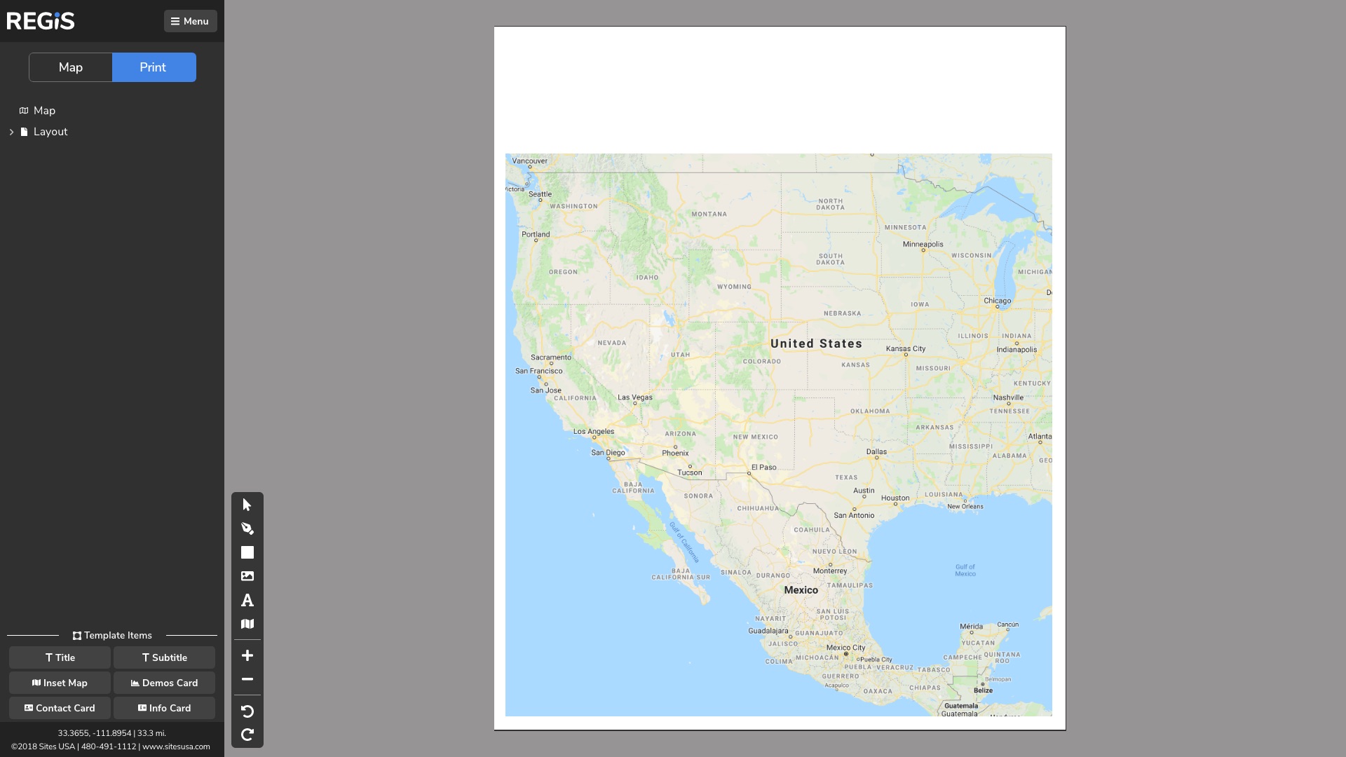
New version of print mode.
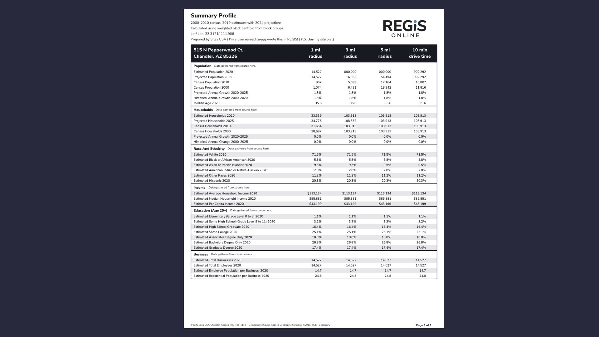
New version of demographic reports.
New Features
Currently we are in the early design phases of some of the new features that will be coming after the full release of a REGIS MVP.
View More
-
Sites USA
-
REGIS
-
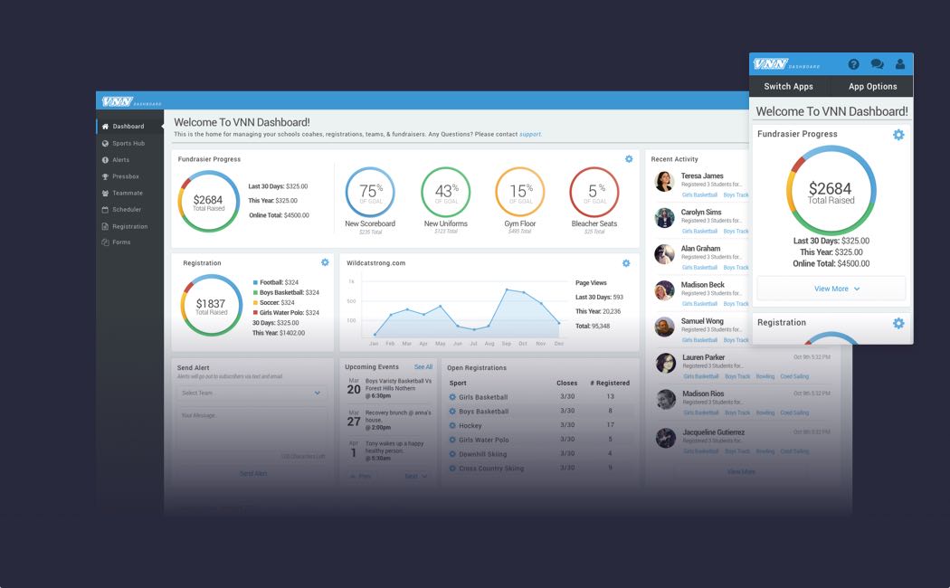
Sports Hub
-
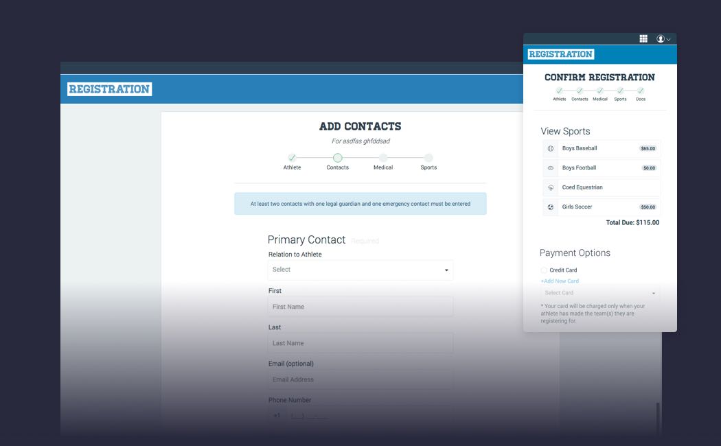
VNN Registration
-
Professional Suite
-
Misc Projects